If you use an iPhone and text folks with Androids, or are in group chats which includes folks with Androids, you might have noticed that the green bubbles are hard to read. Here’s a quick tip to increase the contrast ratio in iMessage:
Go to Settings ➡️ Accessibility.
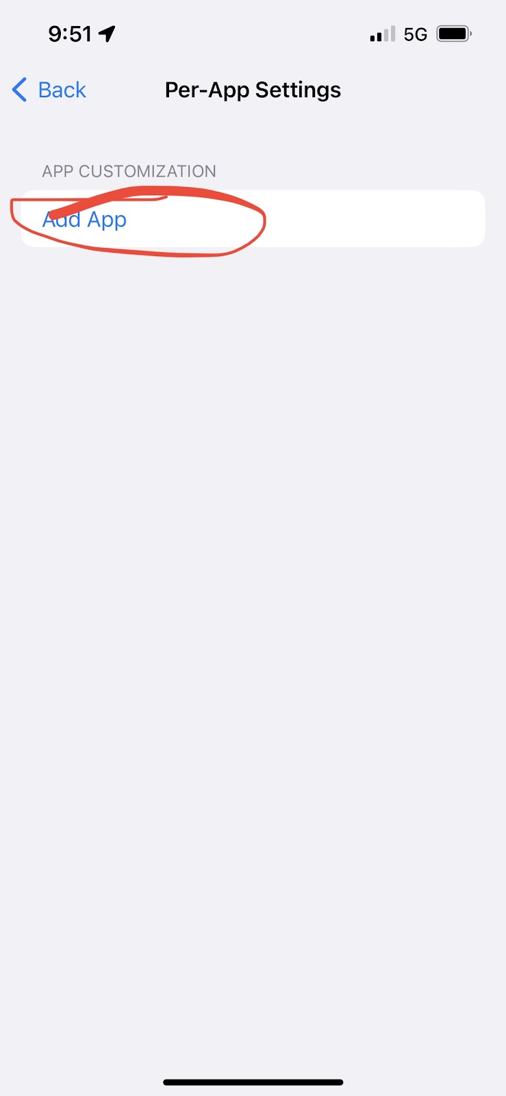
Scroll all the way to the bottom and tap on “Per-App Settings”.
Tap “Add App”
Scroll down to “Messages” and tap it.
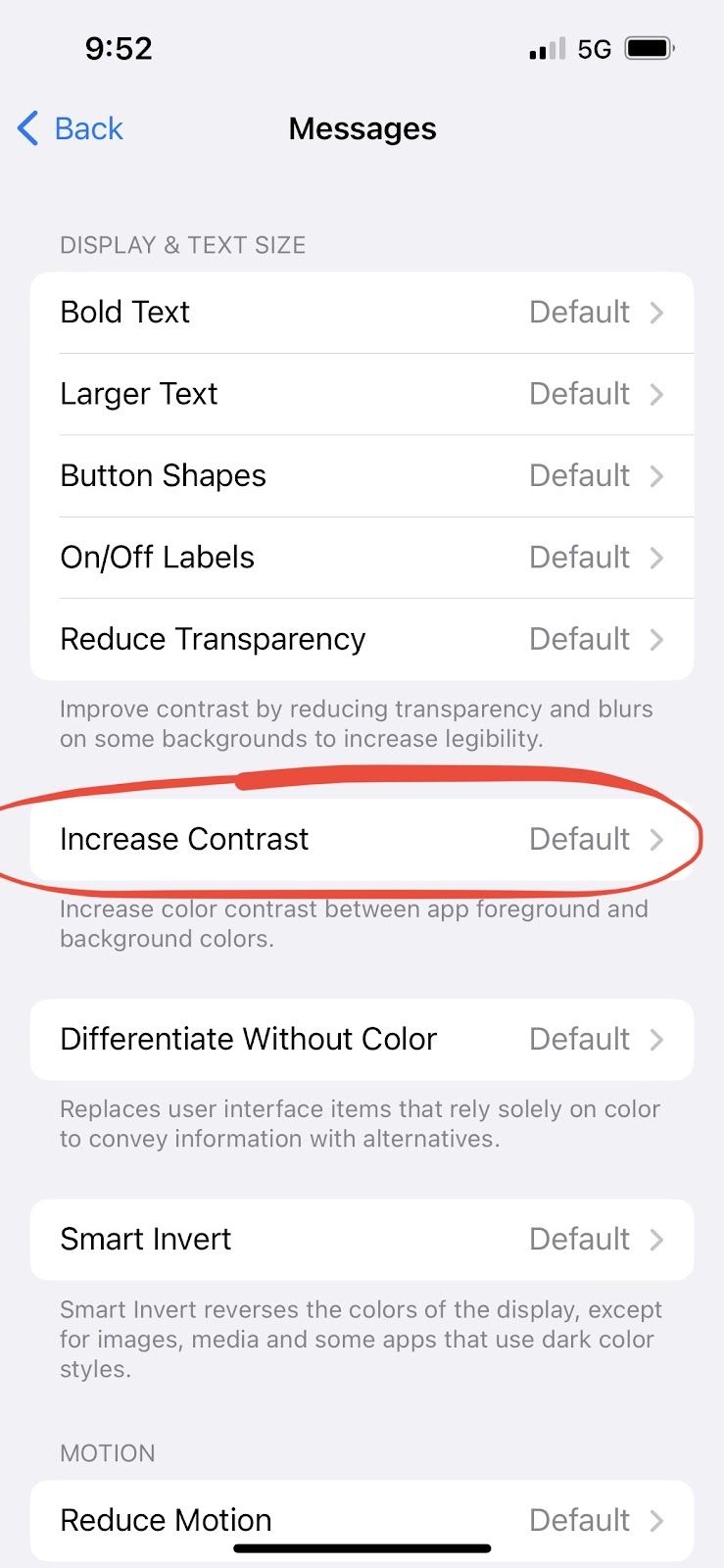
It’ll take you back to the Per-App settings. Tap on “Messages”.
Tap on “Increase Contrast”.
Change it to “On”.


And you’re done. Now the green bubbles will be much easier to read. The blue iMessage bubbles will also have better contrast.
If you’re wondering why the default contrast makes it hard to read in the first place, that’s a different story. If you Google, “Apple messages contrast”, you’ll get a bunch of links of how Apple violates its own contrast guidelines with the green bubbles (and to a lesser extent, the blue bubbles too). The reason is obvious: by making the experience of texting Android folks less pleasant, you associate Android itself as less pleasant, and induces peer pressure on the Android folks to switch, even though it’s the iPhone that’s lessening your experience. Ultimately it helps Apple sell more iPhones. And that’s all I’ll say about this subject.

Where have you been :'(
ReplyDeleteYour follows have fallen into unrest, post now or they will revolt and follow new blogs.
ReplyDeleteYeah I'm out dog
ReplyDelete